BRAND IDENTITY - PRODUCT & PACKAGING DESIGN

BRAND OVERVIEW
Occult Six is not your average brand. It's a community of like-minded individuals who find fascination in the strange and inexplicable. By using eerie "occultic" symbols on their packaging, Occult Six creates an ominous atmosphere that draws shoppers in and captivates their attention. But don't be scared! The brand doesn't take itself too seriously.

In fact, it was created to poke fun at people's superstitions and showcase the silliness of being afraid of symbols that were originally used to represent the weather, the passing of time, and even hope for agricultural growth. At the same time, the brand also plays into common horror tropes by naming their three current flavors Vermillion, Dusk, and Spoiled.

Vermillion represents a vibrant cherry flavor that will tantalize your taste buds, while Dusk sneaks up on you with its crisp apple taste. And Spoiled? Well, you might not know what you're drinking, but it won't stop you from grabbing another.

So the next time you're in a store and feel that tug at the back of your brain, keep an eye out for Occult Six. Who knows what kind of mystery and intrigue you might find around the corner with a bottle of Dusk in your hand.
THE SITUATION
Occult Six is entering the Houston hard cider market and aims to distinguish themselves from the competition. With established big sellers already in the market, setting themselves apart is crucial for growth. Using locally sourced fruits comes with a higher cost, but aligns with their brand promise that they wish to keep for the customers. The key to growing a brand from scratch is building a strong brand identity, leveraging digital marketing, and partnering with local vendors and small business to gain exposure. The brand needs to stand on it's own and create general interest.
THE SOLUTION
Luckily for Occult Six, being local and utilizing local vendors and supporting local businesses goes a long way with the target audience they are trying to reach. On the branding side of things, Occult Six needs to set itself apart from the sea of locally sold hard ciders. I believe that with their unique take on the weird and macabre, they can sell a story wrapped up in an interesting can. People who are in the target audience will love what they stand for and will naturally be drawn to try the brand. Meanwhile, people outside the target audience are sure to want to understand what these new cans on the shelves are all about.
CUSTOMER PERSONA

Occult Six's target audience are customers who value unique and locally sourced flavors, appreciate the brand's creativity, and support for the local community. The audience is active on social media, attends social events and is open to unconventional experiences. Occult Six aims to promote their cider as a suitable option for social occasions, differentiating itself from other alcoholic beverages.

SARA SMITH

AGE:
GENDER:
LOCATION:
EDUCATION:
INCOME:
EMPLOYMENT:

31 years old
Female
Houston, Texas
BFA in Design Studies
Middle to Upper-class
Senior Graphic Designer

INTERESTS:

Health and wellness, local and sustainable food and beverage products, craft beverages, artisanal products, unique and authentic experiences, social events and gatherings, art, self expression, painting, graphic design.

LIFESTYLE:


VALUES:

Active and social with not in the office working, enjoy exploring local events and trying new things.

Appreciation for quality, sustainability, authenticity, and supporting local businesses.

ALEX YURTO

AGE:
GENDER:
LOCATION:
EDUCATION:
INCOME:
EMPLOYMENT:

27 years old
Male
Houston, Texas
Certified Culinarian
Middle to Upper-class
Head Chef at an Organic Restaurant

INTERESTS:

sourcing healthy food options from local vendors, enjoys hard rock and metal, craft beverages, artisanal products, loves creating new experiences for his customers, tasting new flavor combinations, traveling.

LIFESTYLE:


VALUES:

Always in another city, country, state away from his restaurant when he gets the chance to explore some place new.
Loves supporting local vendors and keeping his food local. Appreciates the weird and interesting.

BRANDING
COLOR PALETTE
I chose a variety of colors that represent each of the three flavorings. First pairing is for the flavor "Dusk" I wanted something that felt like a time right when the street lights come on. Second is "Spoiled" and wanted to convey an uneasy color matching something that made people queazy. Last is "Vermilion" and I wanted a color matching that made the red pop like blood on snow.
ICONOGRAPHY
The meaning of these symbols originates from a more organic standpoint. Initially, they were utilized as representations of seasonal changes, to name the earth, water, and sky, and to facilitate communication. However, incorporating the upside-down cross into this mix automatically leads viewers to associate these symbols with malevolent forces and witchcraft.
FONT
"Occult Six" was built from the first O in occult and the T to give a big stamp like feeling. "P22 UNDERGROUND" is the secondary font used for the "brewing co." and all other forms of verbiage for the brand. I chose this font because I liked the abnormal height off the cut outs in the "BR" that gave off this unsettling feeling.

FLAVOR LABELS

These flavors were created to play on specific horror tropes and were designed to be off-putting in terms of their color. I wanted to convey three different kinds of fears through three different flavors to start the brand off. Below is my thought process for creating each flavor concept:

1. Vermilion plays on the fear of seeing blood. There's a statistic that states that if you see a small puddle of blood the size of a dime, your body will react as if you have seen a murder and trigger fight or flight responses. I wanted the branding for Vermilion to be stark white so that the red stands out vibrantly. It was the first flavor I developed, hence why it's kind of the main flavor.

2. Dusk is more of an everyday flavor that you see with cider brands - apple. So, after mulling it over, I really thought about how the branding of the can and packaging would do a lot of the leg work. Giving no context to the flavor until the can is opened gave me the idea of utilizing the "dark and dry" aspects usually associated with apple ciders to almost create a sort of visual pun. That's why I named the flavor Dusk and used the dark street with one streetlight symbology.

3. Spoiled was a wild card. I needed a flavor that would be easy to market on social media with a shocking name and premise. Spoiled was created as an idea of what a cider would taste like if it was only made from sour fruit - not necessarily spoiled fruit, but sour still invokes a reaction. I wanted to play on people's fear of food and what exactly they are consuming.

All three flavors were created with an understanding of how each flavor could be potentially marketed to increase brand awareness.

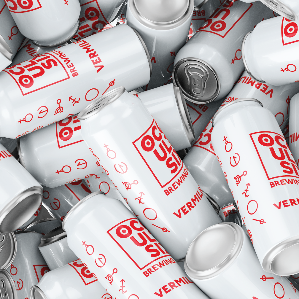
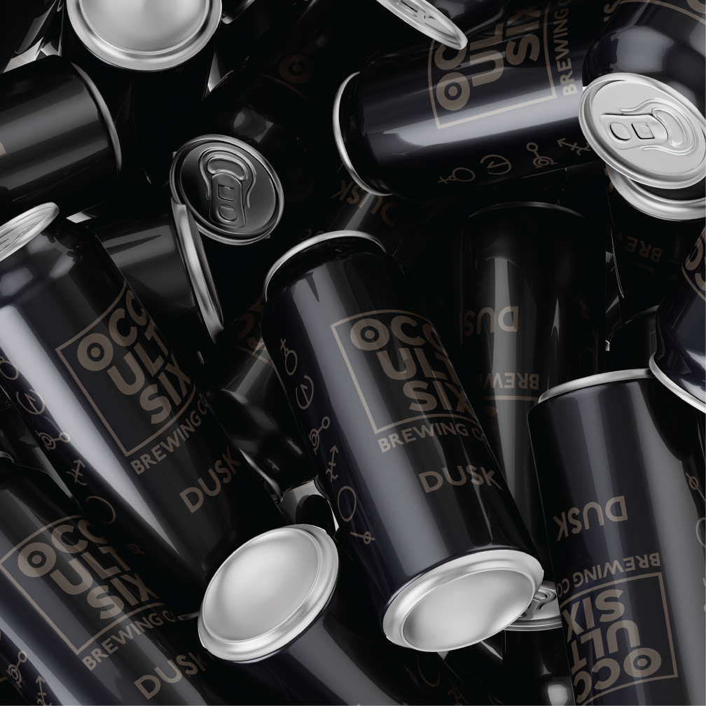
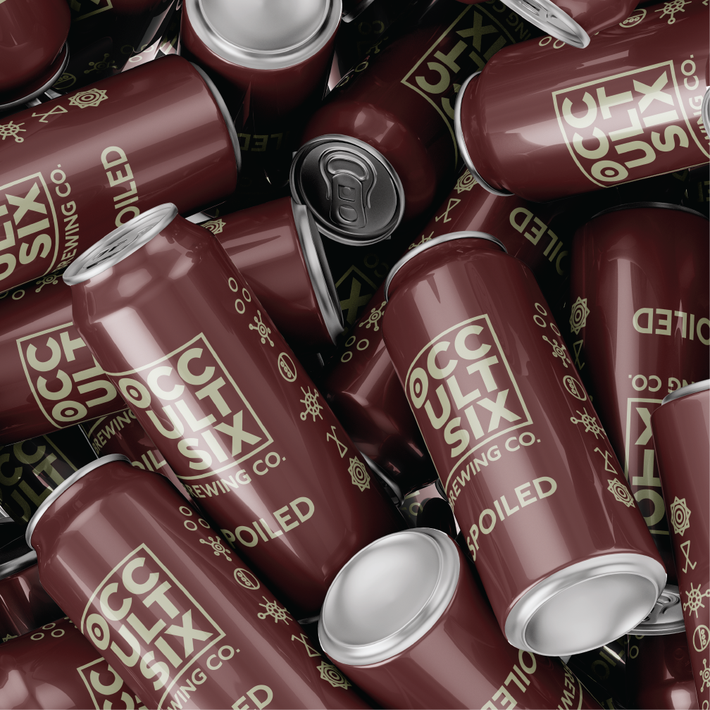
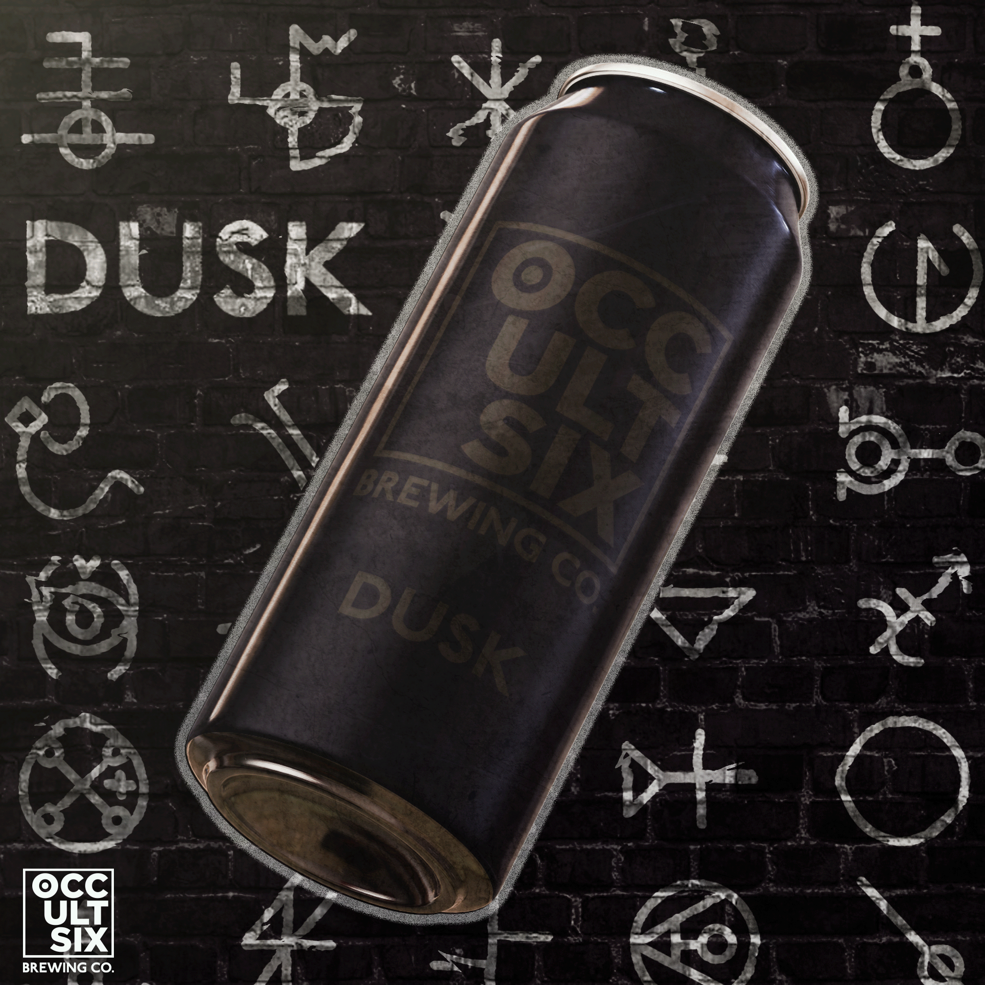
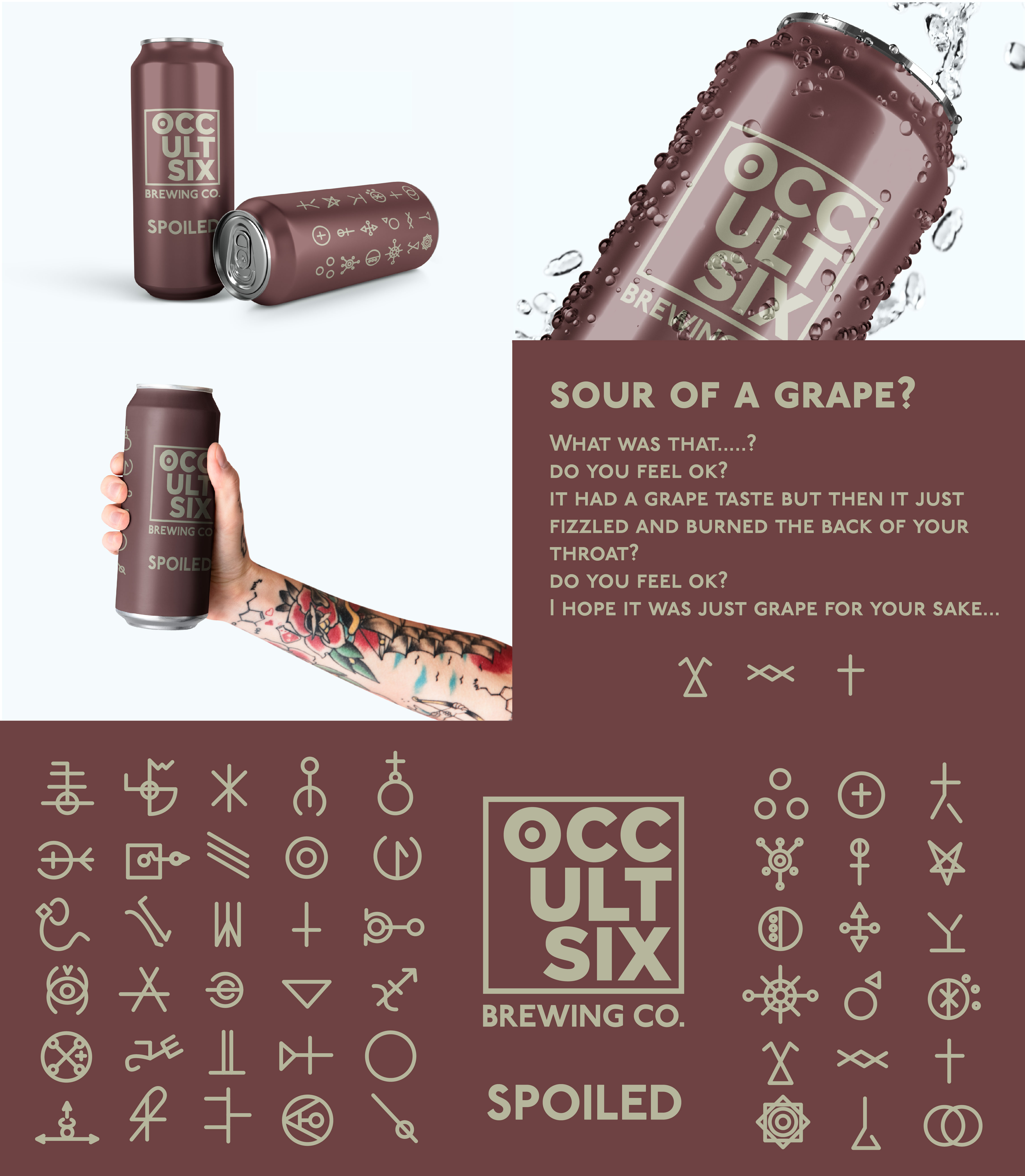
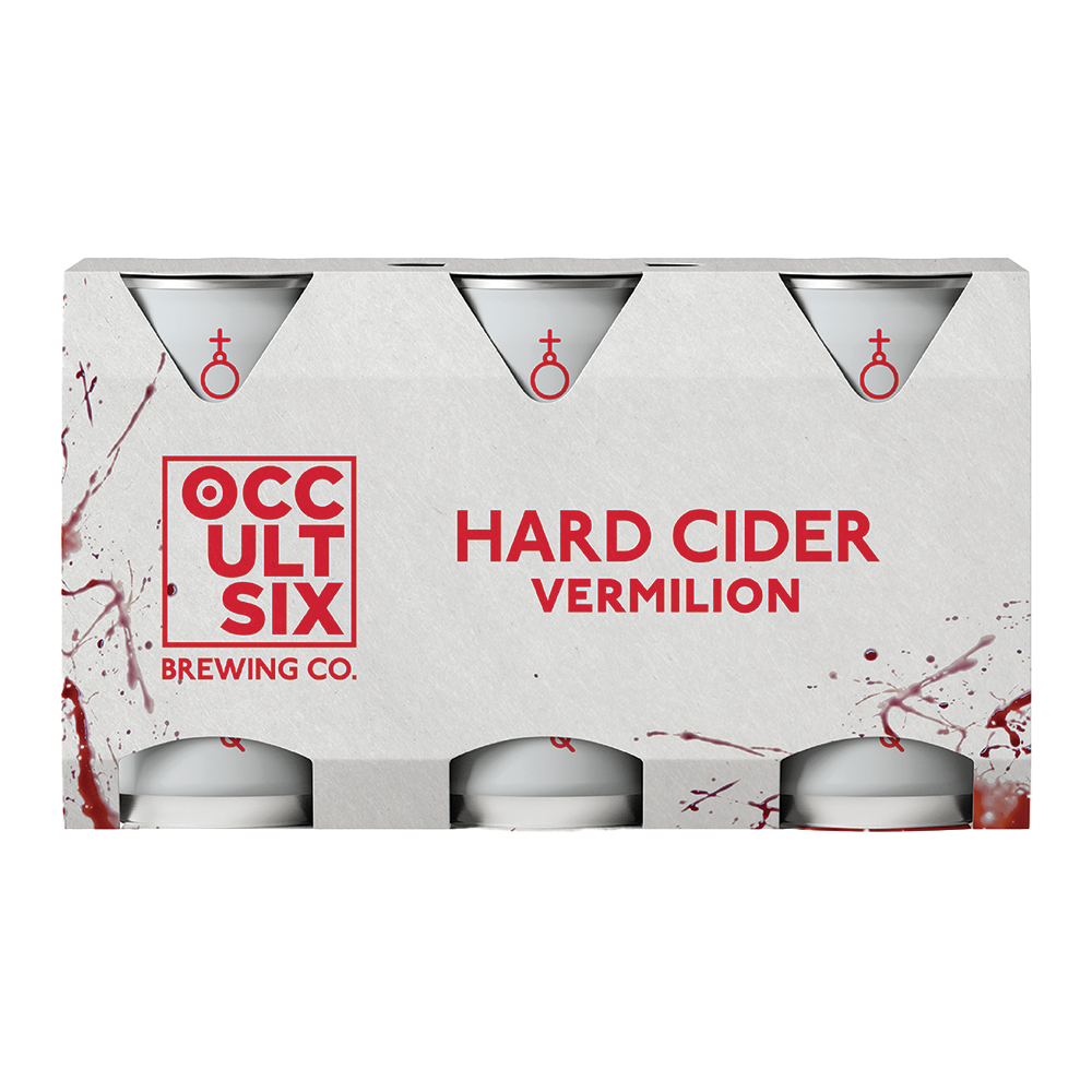
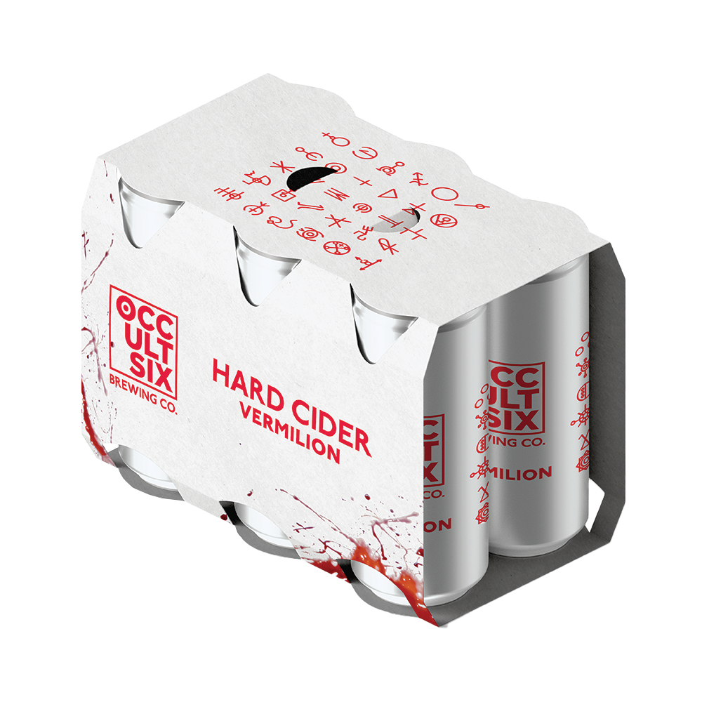
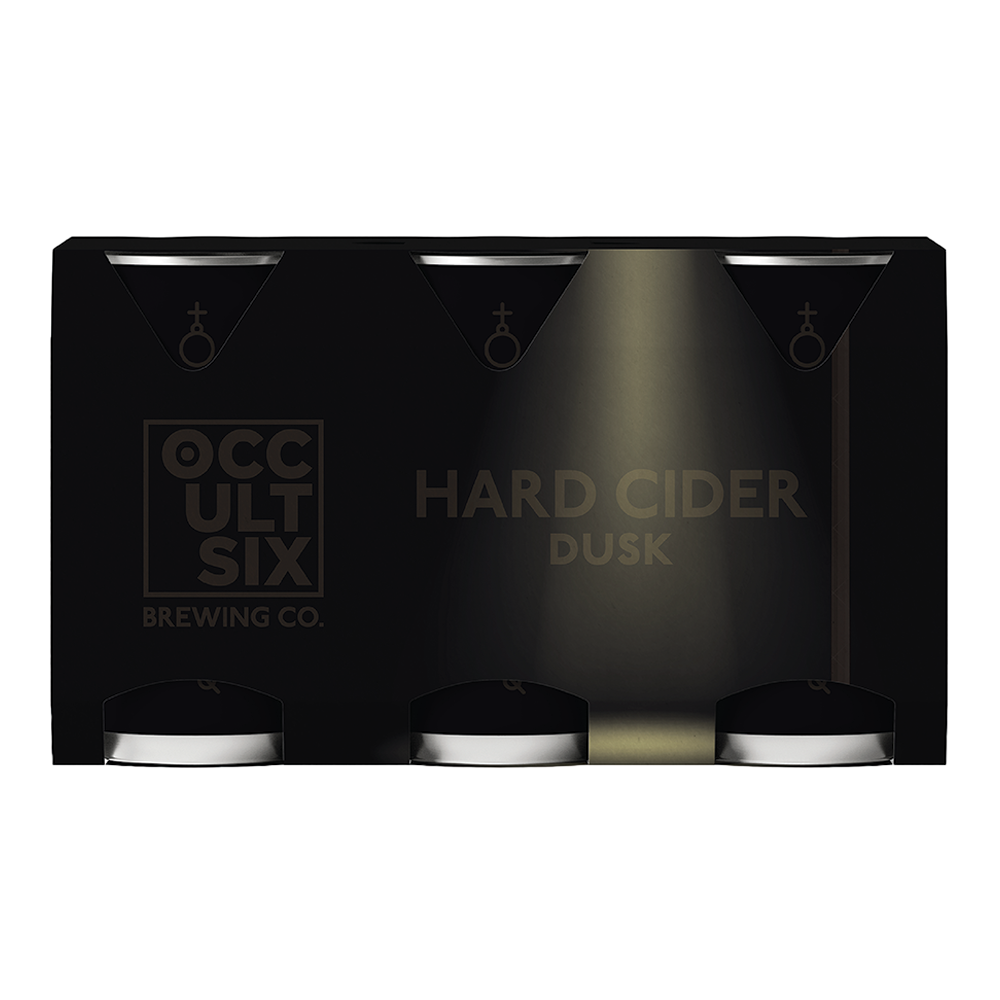
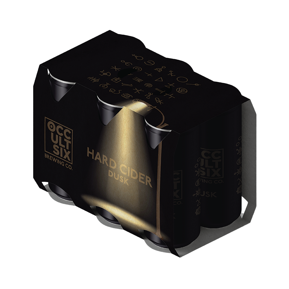
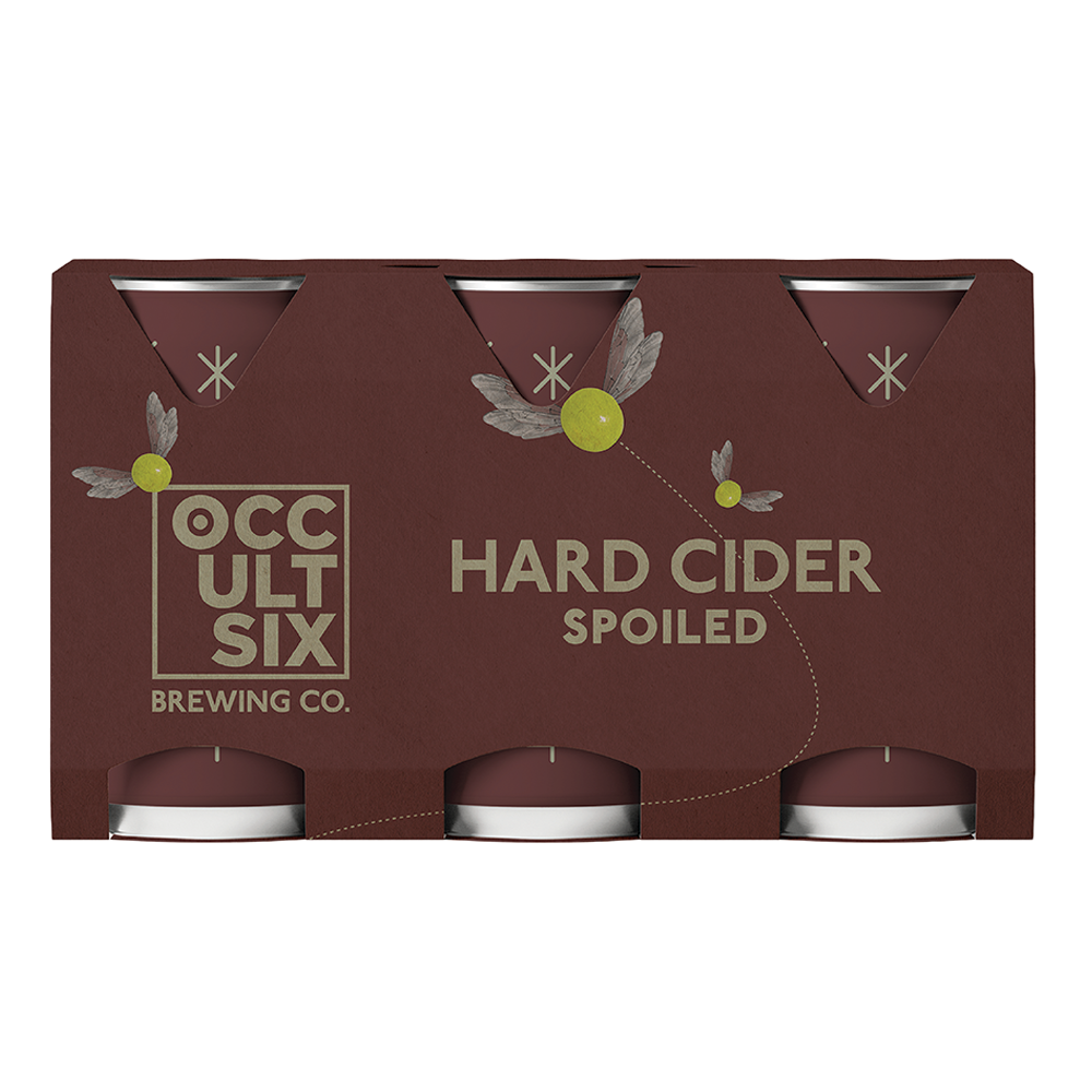
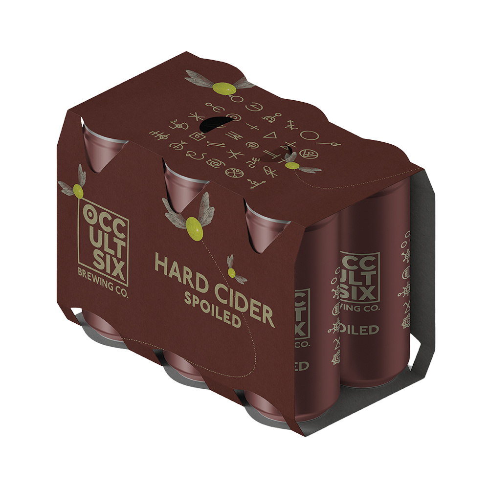
When it comes to designing wraps and packaging for cans, it's important to tell a compelling graphical story that will catch the customer's eye. While limited by only having access to free mock-ups, I did my best to create designs that would stand out. For Vermillion, I wanted to create a shocking effect by covering the bottom of the packaging with a blood texture and adding streams of blood shooting up from the sides. The stark white packaging will create a contrast that will make the design even more attention-grabbing. On Dusk, I aimed to capture the feeling of being alone in the middle of the night. To do this, I made the packaging very dark, almost as if it were midnight, and added text and iconography that is barely visible, lit up only by a lone street light. This will make the customer feel like they're in a solitary place, adding an element of intrigue to the design. Finally, for Spoiled, I wanted to create a creepy, eerie feeling. I decided to use grapes to simulate flies covering the packaging, and added realistic wings to enhance the overall effect. This design will surely make the customer feel a sense of unease, which will make them curious to try the product.Overall, I believe that my designs will grab the attention of potential customers and create a lasting impression.

MARKETING

Above are some marketing examples of different ways Occult Six would promote their brand, ranging from fun and creative social media posts to big sticker sheets that can be found inside each case of Occult Six cider. This project was definitely a way for me to express my creativity and create a brand that allows me to explore different styles of pop culture through horror tropes and themes. I hope you enjoyed looking through my process for Occult Six and will continue to explore my other brands!

THANK YOU FOR VIEWING!

Please consider reaching out at jonathanmason0720@gmail.com