
30 MIN - 1 HOUR LOGO DESIGNS
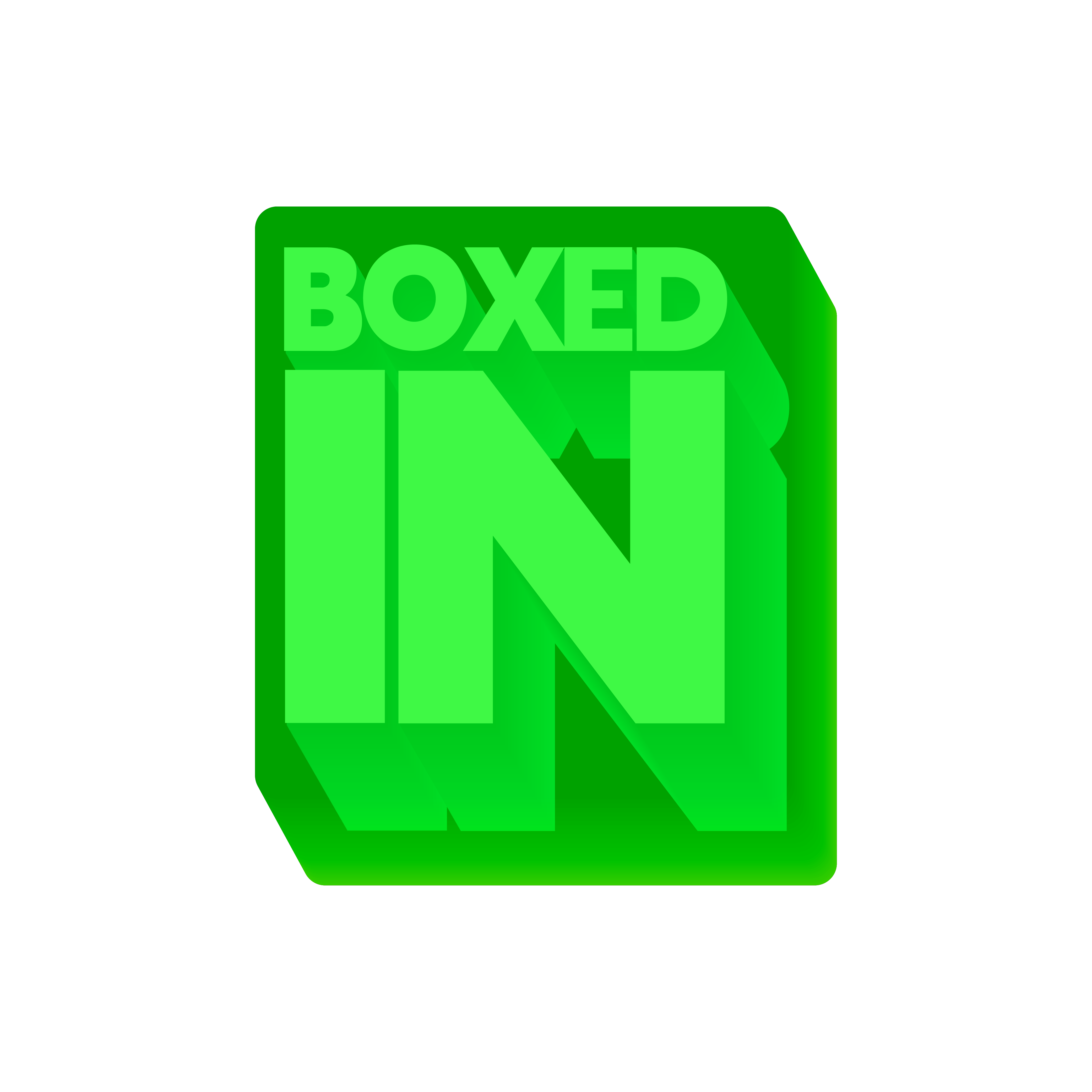
The "Boxed In" logo concept was created as a favor to a friend to help support their small business venture. They sold kits with pre-measured ingredients for people who wanted to learn how to bake but didn't necessarily know how to start. This logo was my favorite variant and was made for their Jello Mold recipes.
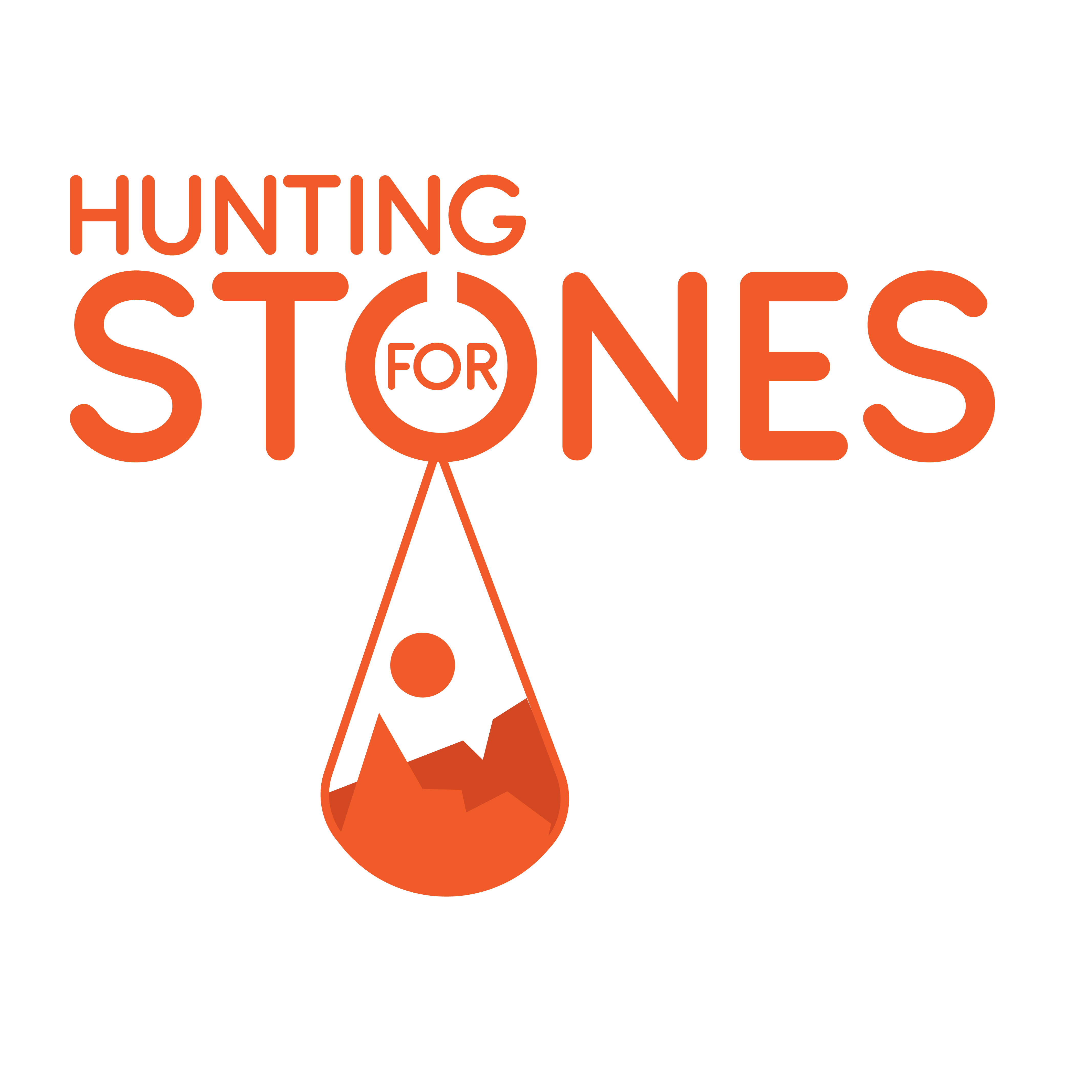
"Hunting for Stones" was created for a coworker who frequently traveled to the US and Mexico in search of special stones to use for her line of jewelry. She usually likes to visit the Grand Canyon and specific mountain ranges in Mexico for her stones. The logo above is the variation she chose to use.
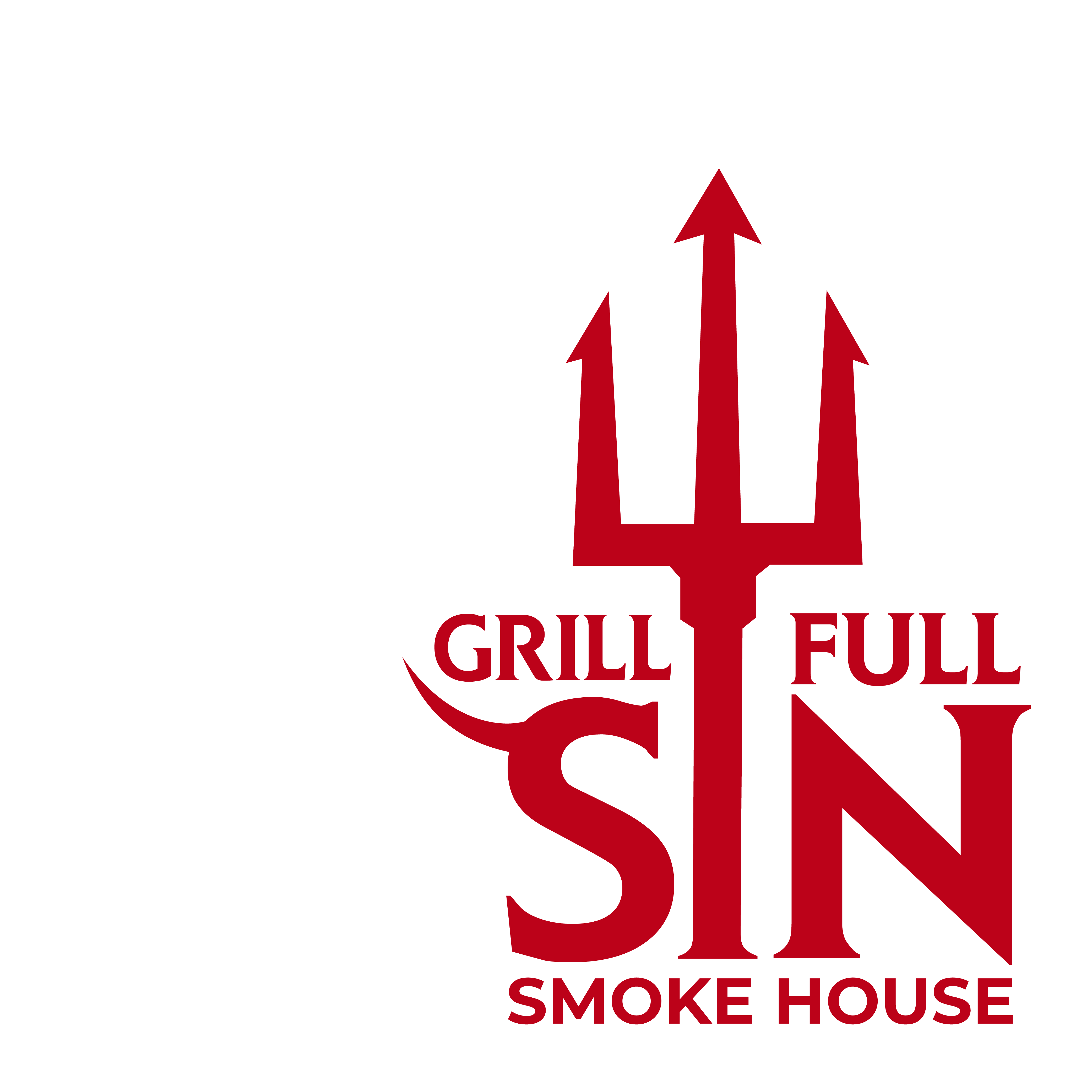
"Grill-Full Sin" is quite literally just a pun. At one of my previous jobs, I was tasked with creating a rebrand for a Smoke House that was trying to promote its spicy BBQ sauces they had become known for. Connecting the idea of spicy BBQ sauces and knowing that they liked to grill all kinds of meat, I envisioned a grill full of spicy sinful BBQ.
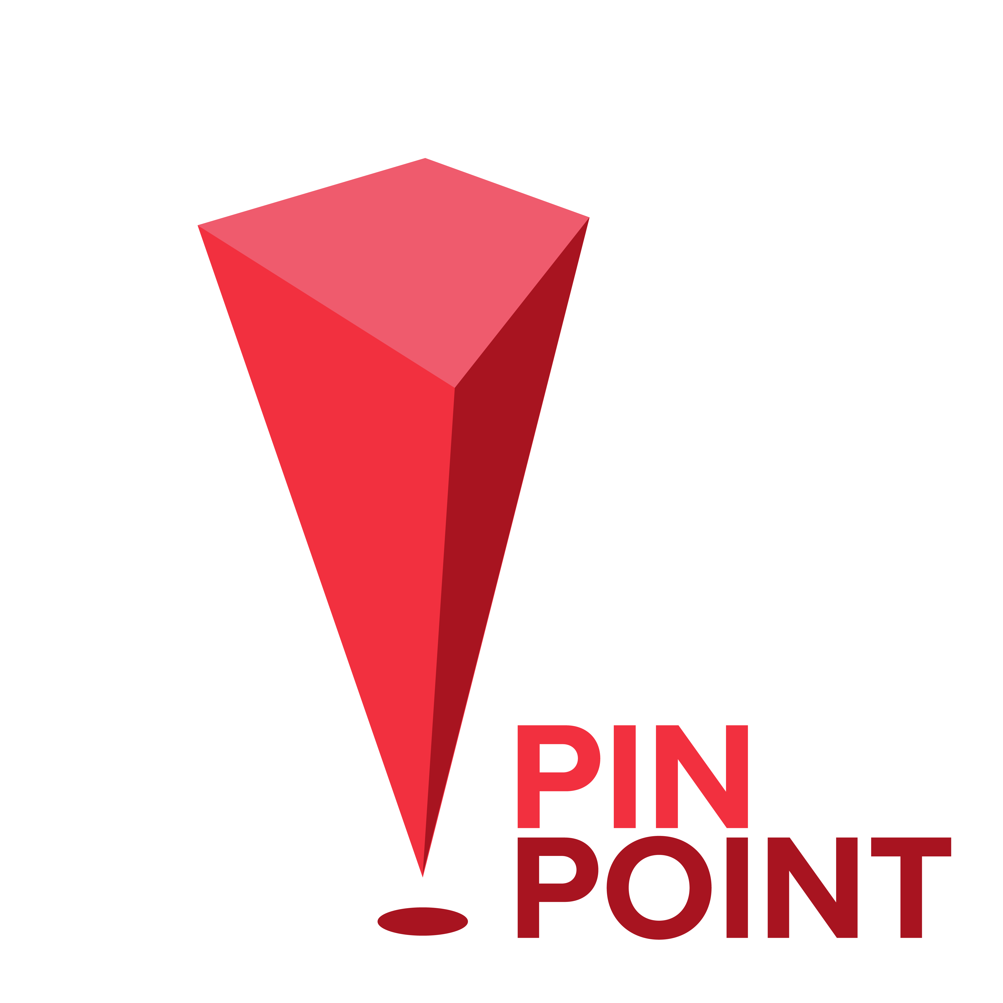
"Pin Point" was created as a design challenge. I was given 3 shapes and had to create a logo from it. It was a lopsided trapezoid which is the top, a stretched oval which is the shadow, & an arrow head which is used as the body

"Fishbone" was also created as a design challenge with shaped given to me. I used all three shapes to create the fish bone silhouettes and put a dot in the "O" to simulated a fish being cut to show the bone. I definitely wanna revisit this idea to improve it.

Last but not least, "Marble Factory" was my last design challenge with shapes. It was an interesting challenge being that I was given a basic circle & rectangle along with a organic body shape. I used the pieces to form the body and used shadows to shape the featuers.
"G//CR" is just a concept brand of a cool coding company name I saw and wanted to create my own version of their logo. It feels more like a sticker design than a logo so I would like to eventually revisit this idea.
"Hidden Delights" was conceived to tap into the surging trend of vegan or vegetarian alternatives, catering to those who seek to satisfy their cravings or explore new food options. I specifically chose the color green to draw attention to the concept and evoke an "aha" moment for viewers upon seeing the full picture.
"Raiz" was created for a family friend's unique Mexican bar concept that revolved around "Bottom's Up" beer glasses. These innovative glasses fill the beer from the bottom to ensure a crisp, frothy foam. The name "Raiz," meaning "root" in Spanish, was a perfect match due to its close association with the establishment's specialized glassware and the roots of Mexican culture. The actual symbol is the flower goddess symbol that symbolizes youth, creativity, and growth as well.
"Sky Orca" was created as a playful and fanciful airline brand. I chose to feature an orca symbolizing its capability of efficiently transporting large groups of passengers to their destination. The planes themselves were designed to appear as enormous orcas soaring through the skies, further emphasizing the brand's powerful and reliable nature.
"Unlikely Guests" is a logo that I developed after regularly observing the plain and uninspiring designs of various pest control trucks during my morning commute. I found that these trucks usually featured only the owner's last name and initials, lacking in creativity and appeal. I aimed to capture attention on the road by presenting a distinctive and eye-catching approach to pest control branding.
"ToolHaus" was a really simple concept. I wanted to see if I could make a real estate company and I got stuck on the idea of a roof top. Unfortunately after seeing every design out there uses that symbology for Real estate I switched gears and thought about a sub company of carpenters who are hired to make the houses that real estate agent sell. That's how ToolHaus was made.